Readability and legibility
- Josephine Wall
- Aug 19, 2025
- 7 min read

Updated: Aug 27, 2025
When writing a text, several aspects need to be considered in order for it to be successful. Exactly which aspects these are depends on the function of the text and its audience.
In this post, I will focus on two important concepts once the raw version of the text is complete: readability and legibility. This text focuses solely on text in digital format, such as blog posts and newsletters, and not printed text, as that is an area that deserves its own post.
Legibility
A legible text is defined by its typographical characteristics, i.e. how accessible the text is visually to the reader. Most of us have made typographical changes at some point without thinking about the fact that we were working with typography. When you have written a text and changed the font, size, or line spacing in a Word document, you have done typographical work.
We will go through six areas for making a text readable:
Font
Size
Impact
Line spacing
Line length
Contrast
Fonts
A good guideline is to stick to fonts that are already available on all digital devices. These fonts include Arial, Verdana, and Georgia. These are called web-safe fonts, which means that they look basically the same on all devices. This group of fonts has expanded over the years thanks to Google's font database (Google Fonts), which opens up a little more creative freedom.
A legible font needs to meet the following conditions:
It is airy, meaning that the letters do not risk merging together.
It has a uniform thickness.
The text should be readable even in small formats without the letters merging or disappearing, regardless of the background.
The eye should be able to decode the letters naturally. If you are wondering whether it is a ‘b’ or an ‘h’, you should find another font. In typography, this is called word image.
Have both lowercase and uppercase letters. Body text should never be written in uppercase only.
Whether you prefer a sans-serif or a serif font is a matter of taste and depends on your graphic profile. A serif font has serifs, i.e. small feet and flags on the letters, which help the eye to follow the line of text. This is why serif fonts reign supreme in printed material such as books.
In digital format, however, serifs can make the text difficult to read. This is especially true if the text is small, as the serifs can merge with each other if the font has been affected in some way (we will come back to this later). Sans-serif fonts are now more the rule than the exception in digital contexts.
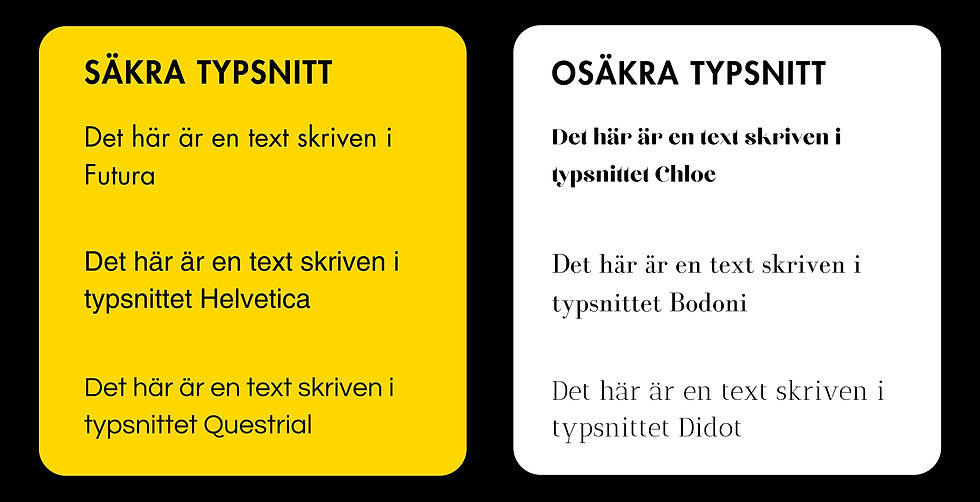
Great examples of easy-to-read digital fonts:
Raleway, Helvetica, Arial, Questrial, Roboto, and Verdana are all examples of really easy-to-read fonts. In the example below, you can see the difference between web-safe fonts and fonts that shouldn't be used in running text in digital format.
This is a comparison on safe vs unsafe fonts.
Text sizes
Opinions may differ depending on whom you ask. Some believe that the minimum size should be 16 points, while others believe it can be lower, perhaps 12–13 points. The development of responsive design has reduced the work involved in optimizing text sizes. Instead of starting from a fixed size, you can choose a range for the text to stay within, where the size varies depending on the screen size. We would say that it is good to stay within the range of 12-16 points for regular body text. It is also important to remember that the size can vary between different fonts. For League Spartan, like this text, 18p is better suited for a computer mode, and around 16p for mobile mode, but no lower than 14p.
Alterations
Let us now consider an area previously mentioned, which is the impact, or alteration, of the font. By this, I mean that the font in its original form is thin/normal and that it is made bold or italic. This may be effective in exceptional cases, but it is not optimal as it impairs the harmony of the letterforms. When it seems to work even though you are not actively choosing a font variant, it is most likely because the font variant is changing without you noticing.
One sign that it is not working is that the text looks grainy. The solution to this is to find another font that has several variants. The image below shows an example of how things can go wrong when the font is affected and how it impairs the reading experience.

Line spacing
Line spacing does not come with any exact rules that apply in all contexts. Factors such as font type and line length need to be taken into account. The aim of line spacing is to create a natural space between lines. The spacing should be large enough for the eye to find the next line naturally and not confuse it with another line.
Most digital platforms usually only have one setting for line spacing, where the available options can vary between 1.15 and 2.0, sometimes lower or higher. The text you are reading now has a line height of 1.6, which I have found to be optimal for this particular font and size.
Line length
Line length, or type width if you are talking to a typographer, is the number of characters per line. Here is a good rule of practice to follow: a line of text should never exceed 60 characters. This number also includes spaces and punctuation marks. For mobile mode, approximately 45 characters is optimal to avoid the text covering the entire screen. This text is best read on a mobile phone, for anyone who is curious!
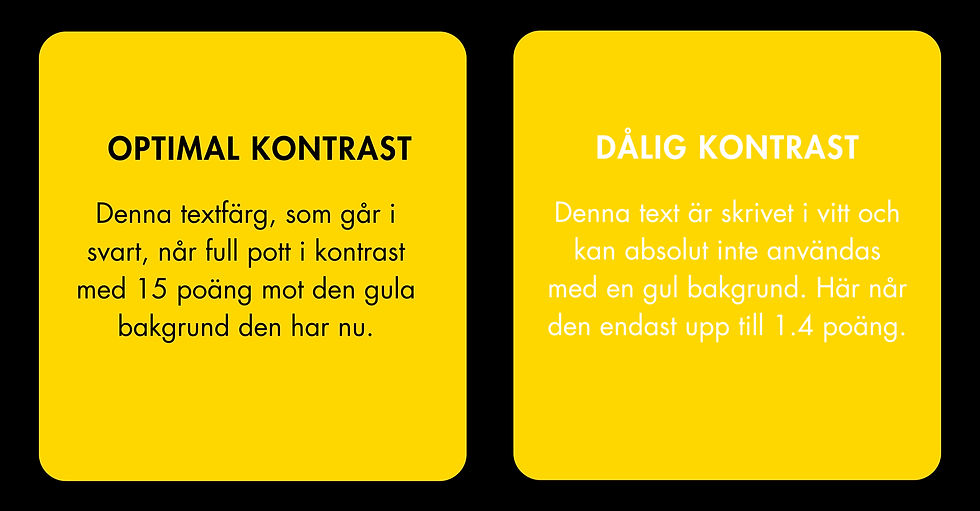
Contrasts
Now we are at the last topic in this section, which is about contrast. In this context, it is important that the contrast between text and background is as high as possible. The easiest contrast to work with is, obviously, black and white. It is optimal for all types of devices and also for people with color blindness or impaired vision. If black and white is not part of your graphic profile, you should start with the darkest shade in combination with the lightest or, preferably, white to achieve high readability. There are plenty of digital tools where you can test the contrasting ability of colors. In the example below, you can see a clear demonstration of the importance of high contrasts.
Readability
The legibility of a text indicates its level of difficulty. In the 1960s, LIX (legibility index) was developed. This index is based on a formula that weighs the total number of sentences and words in the text, as well as the number of long words. A word exceeding six characters is considered long.
This is how LIX grades different types of texts:
<25: Children's books
25-30: Simple texts
30-40: Fiction
40-50: Factual information, such as encyclopedias
50-60: Non-fiction
>60: Advanced texts, such as dissertations
How can this model be applied in real life?
There are several ways to answer this question, but they all have one thing in common: you need to know your audience. For educational purposes, I've have divided this into different sections with practical examples of how you can approach this.
Target group
Consider these questions:
Who is supposed to read the text? Is it a ka läsa texten? Is it a consumer or is the content meant for a professional audience?
Is the reader informed on the topic addressed in the text?
Does the reader have any specific needs that need to be met?
Example 1:
The reader is a customer in your e-commerce business. You are selling in general easily accessible products with a focus on sales rather than education. The text should therefore be in the range of 30-40 points.
Example 2:
The text is intended for professional retailers who are experts in the field. They are well versed in the terminology and can therefore understand a text in the range of 40-60, but no higher than that.
Example 3:
The reader is learning the language in which the text is written or needs extra clarity for other reasons in order to understand the content. The text therefore needs to have short sentences and use words that are as simple as possible. The range should be 25-30 at the very most.
The purpose of the text
Consider the following question:
What is the aim with the text? Is it supposed to be entertaining, selling, educative or purely informative?
Example 1:
The text is meant to be entertaining and targets the average consumer. The rule here should be the shorter, the better word wise. No complicated terminology. Recommended range should be between 25-40.
Example 2:
The text needs to be informative as it is a product description. A consumer should be able to understand the function of the product, the content or material of it, and also how it solves an eventual issue. In this case, any advanced terminology or professional terms should be avoided, which tend to increase the LIX points. The text should be somewhere between 30-40.
Example 3:
The text is both informative and selling as it is meant to be used as education material with B2B retailers in mind. The text should have a great mix of clarity, such as selling arguments that can be applied in the daily talks with customers, and professional terminology in order to fully explain the complexity of the product. This text should span between 40-50.
Format & timing
Consider the following questions:
How do you plan to share the text? Is it in a newsletter? A product description? Instructions?
When should the text be read?
Example 1:
The text is a part of a newsletter with a consumer public. It should be easy to read in different kind of locations where the consumer might be when they open the email. On the subway on their way to work, during the lunch at a noisy café or maybe at home when the kids finally went to sleep. In this case, any complicated sentences or terminology should be avoided. Keep it short and sweet. The text should span between 30-40.
Example 2:
The text is part of the instructions for a tool for private use. Here, the text needs to be very concise and effective. The choice of words must be consistent with the rest of the information in the instructions, such as ensuring that the different parts of the tool are referred to by the same names in the text as they are in the overview. For this example, the text should be no longer than 30-40 words.
To wrap it up
A text becomes legible and readable when given the right conditions. A legible text has a well-designed visual appearance, where font, size, and contrast are the most important aspects. A readable text has content and structure that is adapted to its audience. The LIX value corresponds to the purpose of the text and its readers.
Ps. The LIX value of this text is 40.
